The Short Answer
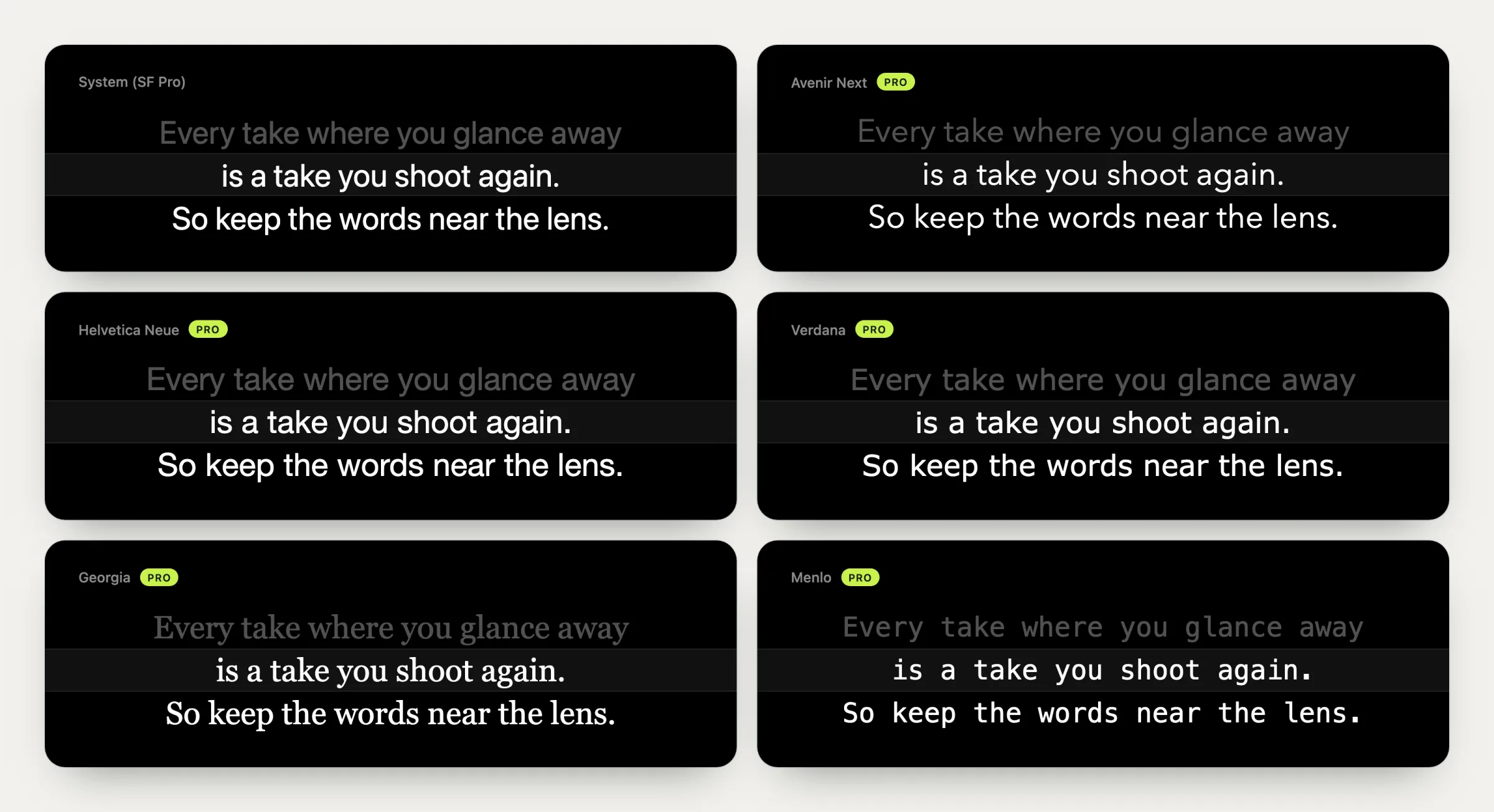
- Font: a plain sans-serif such as SF Pro, Helvetica Neue, Avenir Next, or Verdana.
- Case: normal sentence case. All capitals read slower.
- Colour: white text on black.
- Size: 26 to 30 pt on a MacBook, about 30 pt on a desktop display, and larger as you move back. There's a table below.
- Line width: as narrow as you can comfortably read, centred under the camera.
The rest of this article explains why, because once you know what the settings are for, you can tune them for any setup.
What You're Actually Optimising For
On a teleprompter, legibility is only half the job. The other half is how your eyes look on camera while you read. Anyone watching can see your eyes move, and they notice it before they notice anything you say.
There's good research on how much movement people notice. In a study presented at CHI 2002, Milton Chen at Stanford found that viewers still perceive eye contact when the speaker looks up to about 5° below the camera, but only about 1° to either side. People are roughly ten times more forgiving of a downward glance than a sideways one.
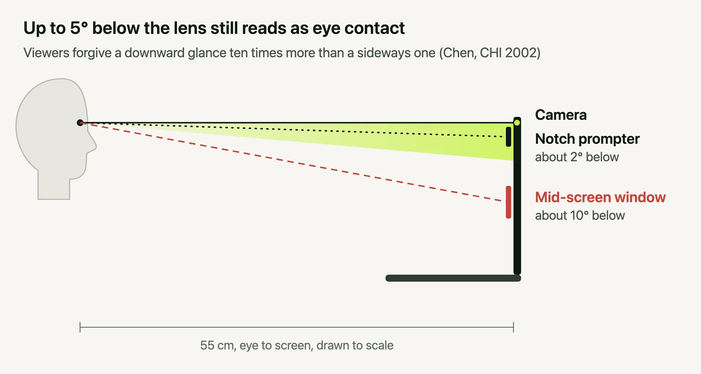
Two rules follow from that, and they drive every setting below.
- Keep the text just below the lens. At 55 cm from a laptop, 5° is about 5 cm, so the line you're reading should sit within a hand's width of the camera.
- Keep the lines short. Your eyes sweep left to right on every line, and sideways movement is what viewers spot first.
Font: Plain, Sans-Serif, Sentence Case
Any clean sans-serif works. You'll be glancing rather than reading closely, and simple letterforms hold up better at a glance and from a distance. Serif faces like Georgia are perfectly readable at large sizes, if you prefer them. Monospaced fonts like Menlo set fewer words per line, which works against you.
Old broadcast prompters often ran in all capitals, but sentence case reads faster. In Tinker and Paterson's classic legibility studies, text in all capitals was read measurably slower than lowercase, because lowercase words have distinct shapes the eye recognises. Capitals also take more width, which means longer lines.
Colour: White on Black
White on black is the convention for good reasons. A mostly black screen throws less light on your face, so it doesn't change how you look on camera. It has strong contrast. On a beam-splitter rig, black is the part of the screen the camera sees straight through, so it's the only background that works. A softer white or a light tint is easier on the eyes over a long session, if you find pure white harsh.
Size: Work It Out From Distance
The right size depends on how far you sit from the screen. These starting points set the text slightly larger than book print at each distance, so you can read a phrase at a glance without leaning in:
| Setup | Distance | Start at |
|---|---|---|
| MacBook, close | 50 cm | 26 pt |
| MacBook, arm's length | 60 cm | 30 pt |
| 27-inch display on a desk | 70 cm | 30 pt |
| Display across the room | 1 m | 45 pt |
| Monitor under a beam-splitter rig | 1.5 m+ | 65 pt and up |
Then adjust by feel. If you catch yourself squinting or leaning forward, go up a step. If you can only fit two or three words on a line, come down one. Text that's too large is a problem too, because short lines force you to scroll faster and lose your place more often.
Line Width: The Setting Most People Miss
Line width decides how far your eyes travel on every line, and that sideways sweep is the movement viewers notice. Here's the sweep for a few common layouts:
| Layout | Line width | Eye sweep |
|---|---|---|
| Narrow prompter in the MacBook notch | 8 cm | about 8° |
| Notch prompter at full width | 16 cm | about 17° |
| Window across most of a MacBook screen | 24 cm | about 25° |
No readable line fits inside the 1° that viewers allow sideways. What you can control is how far your eyes travel and where they come back to. Keep the sweep small and centred on the lens, so every line brings your eyes back under the camera. Centred text helps, because every line balances around the middle, so your eyes swing out and back across the lens instead of drifting off to one side. A column of five to eight words is a good target.
Line Spacing
A little extra space between lines makes it easier to find your place after you look up. Too much spreads the script vertically, and your eyes drift further down the screen. Something close to normal paragraph spacing is a good start.
Setting This Up in Avocado
Avocado puts the prompter in the MacBook notch, so the text starts about 2° below the camera, well inside the zone that reads as eye contact. To set it up:
- Text size runs from 16 to 72 pt and starts at 24. Use ⌘+ and ⌘− to change it while the prompter is open, and ⌘0 to reset.
- Notch width runs from 300 to 800 points in Settings. Narrow it until each line holds five to eight words at your text size.
- Colours: white on black by default, with your own text and background colours if you want them.
- Typeface and line spacing come with Avocado Pro. Five easy-to-read faces are pinned at the top of the list (Avenir Next, Helvetica Neue, Verdana, Georgia and Menlo), and any other font installed on your Mac works too. Line spacing runs from 0 to 24 points.
- Mirror text flips the script for a beam-splitter rig.
Speed is the last setting, and the one font settings can't fix. A fixed scroll either drags you along or leaves you waiting. Avocado Pro scrolls with your voice instead. If you'd rather set a speed, here's how fast to speak on camera.